design
Marketing & Data Platform Aperia Design System U.S Banking System Mental Health Mobile App Medical Product
about
Manh Tai
linkedin resume
Manh Tai
Manh Tai
Marketing & Data Platform Aperia Design System U.S Banking System Mental Health Mobile App Medical Product
about linkedin resume

THANKS FOR STOPPING BY!

Ping me: manhtaiphung@gmail.com

  • Overview
  • Challenge
  • Goals
  • Roadmap
  • Design System Basics
  • Building out of Tokens
  • 8-grid System
  • Building Sample
  • Building the Foundation (Design Tokens)
  • Other Tokens
  • Building Components
  • Documentations
  • Update All Interfaces
  • Accessibility Assessment
  • Client Feedback
  • Key Takeaways
Aperia Design System banner

Result: 962 components have been built, enabling designers to reduce delivery time by up to 5x.

Company

Aperia

Role

Senior UX Designer

Team

Design Manager, Product Manager,
Tech Lead

Timeline

May - July 2022 (3 months)

Overview

Aperia

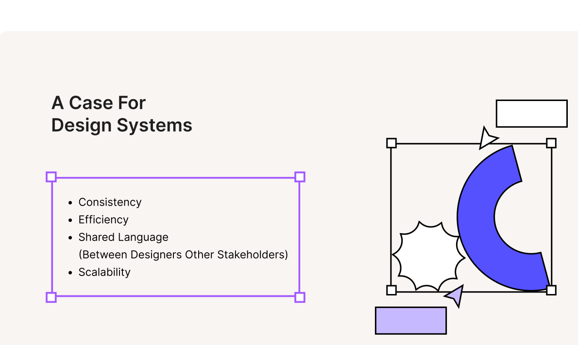
As Aperia's product ecosystem expanded, the experience across products became inconsistent due to the absence of a shared design system. Teams were solving similar problems in different ways, leading to duplicated effort, uneven UX quality, and limited scalability.

I led the effort to define a shared design foundation that could unify components, interaction patterns, and design standards across products. The objective was to improve consistency at the ecosystem level, strengthen usability, and create a more efficient system for teams to design and build with.

⚠️Challenge

There’s no design system at Scene Health and the current design is unresponsive

  • Aperia had a large product ecosystem, but there was no shared design system across teams. In banking, this matters because users need clear, familiar, and trustworthy experiences across every product and workflow.
  • Without a design system, teams had to recreate patterns and components again and again. This slowed delivery and made it harder to keep the experience consistent, accessible, and reliable in a high-stakes banking environment.

🏆Goals

Aperia needed to

  • Update the existing product with the new branding effectively and consistently.
  • Speed up the mock-up speed of the design workflow.

Road Map

With multiple products across the Aperia ecosystem, maintaining consistency became a growing challenge. I built the design system to create a shared foundation that could scale across products, streamline collaboration, and improve the overall user experience.

2 sprints

Design Tokens

Define the core visual styles for color, type, spacing, and layout across the ecosystem.

2 sprints

Accessibility Assessment

Review the system against accessibility standards and identify priority issues to fix.

2 sprints

Component Library

Build reusable components and shared states for the most common patterns.

2 sprints

Copy Standards

Standardize product language for buttons, forms, validation, and system feedback.

2 sprints

Documentation

Write clear guidance for usage, behavior, and best practices across the system.

2 sprints

Rollout

Prepare the design system for adoption through feedback and team alignment.

Design System Basics

Building out of Tokens

  • The token is the smallest pieces in the design system. They represents a design property or characteristic, such as color, typography, spacing, or shadow.
  • Tokens are used to maintain consistency and streamline the design and development process within a design system. Every component in the design system is built out of various tokens. In our design system, we call tokens Foundation.
Examples of color, typography, radius, and responsive tokens

8-grid System

  • Utilizing numbers like 8 to size and space elements makes scaling for a wide variety of devices easy and consistent. The majority of popular screen sizes are divisible by 8 which makes for an easy fit.
  • The principle of 8pt Grid is that to use multiples of 8 to layout, dimensions, padding, and margin of elements.

Building Sample

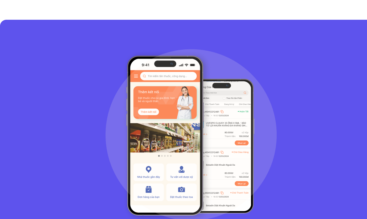
Prior to building the library, I created mockup design options for key pages to ensure alignment with our rebranded tone of voice: motivating, supportive, energetic, and conversational. This allows stakeholders to visualize the new branding on both products effectively.

Dashboard and queue review sample screens

Building the Foundation (Design Tokens)

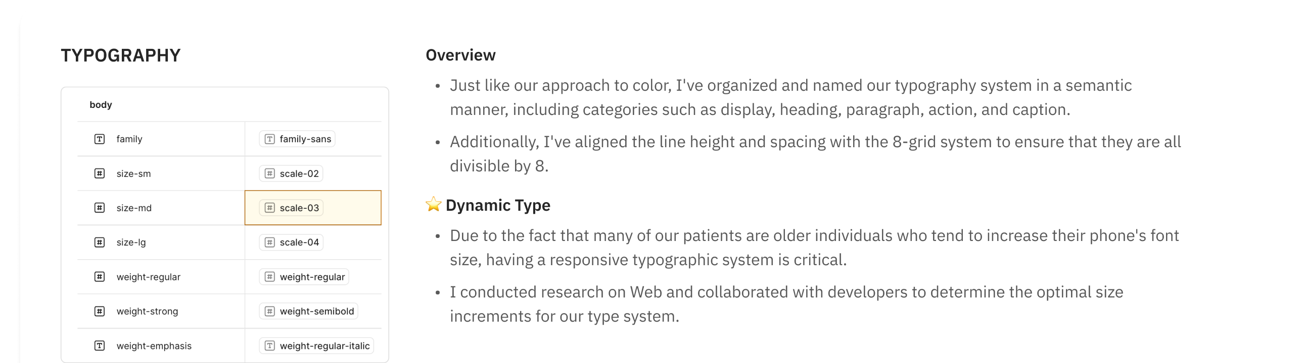
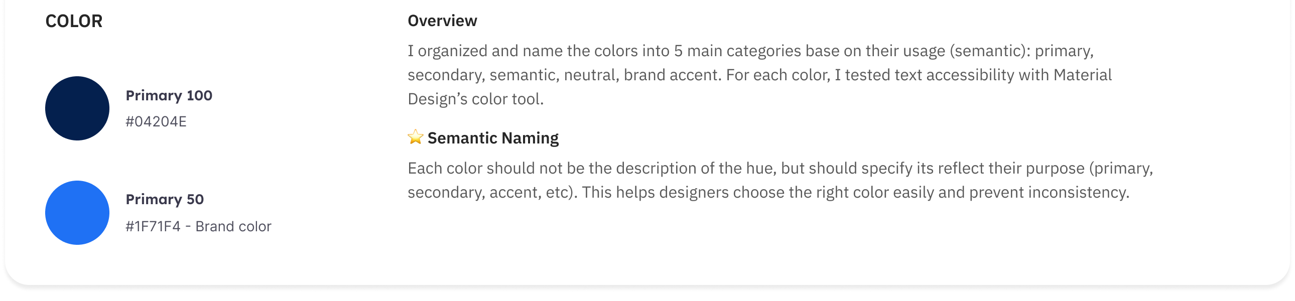
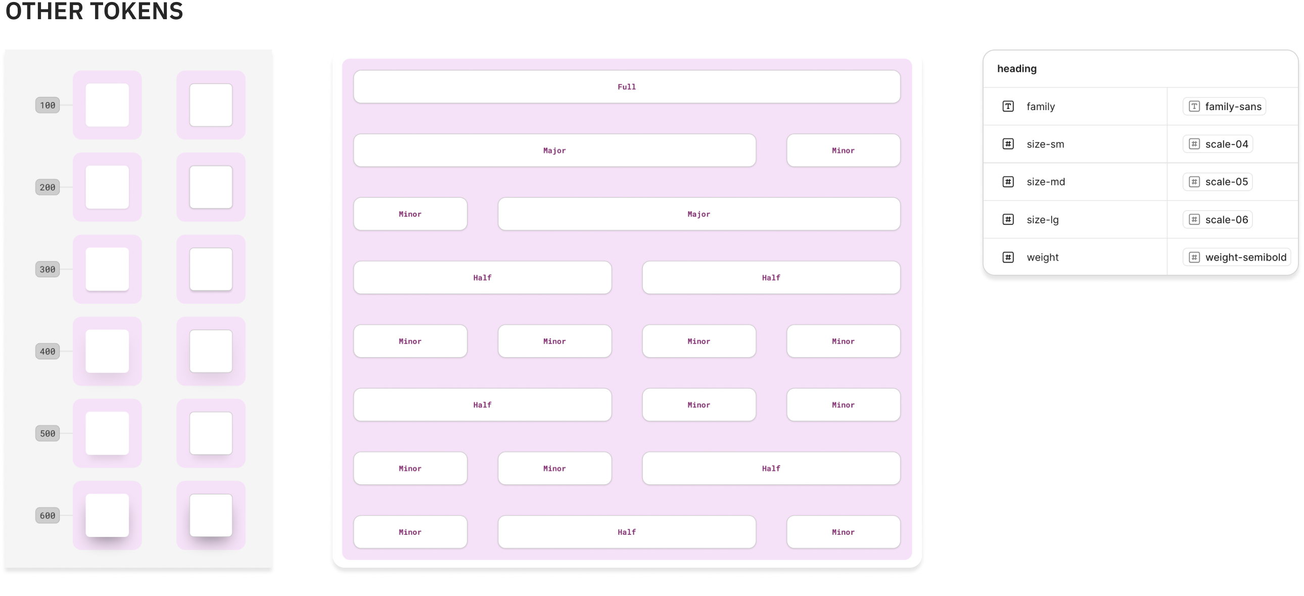
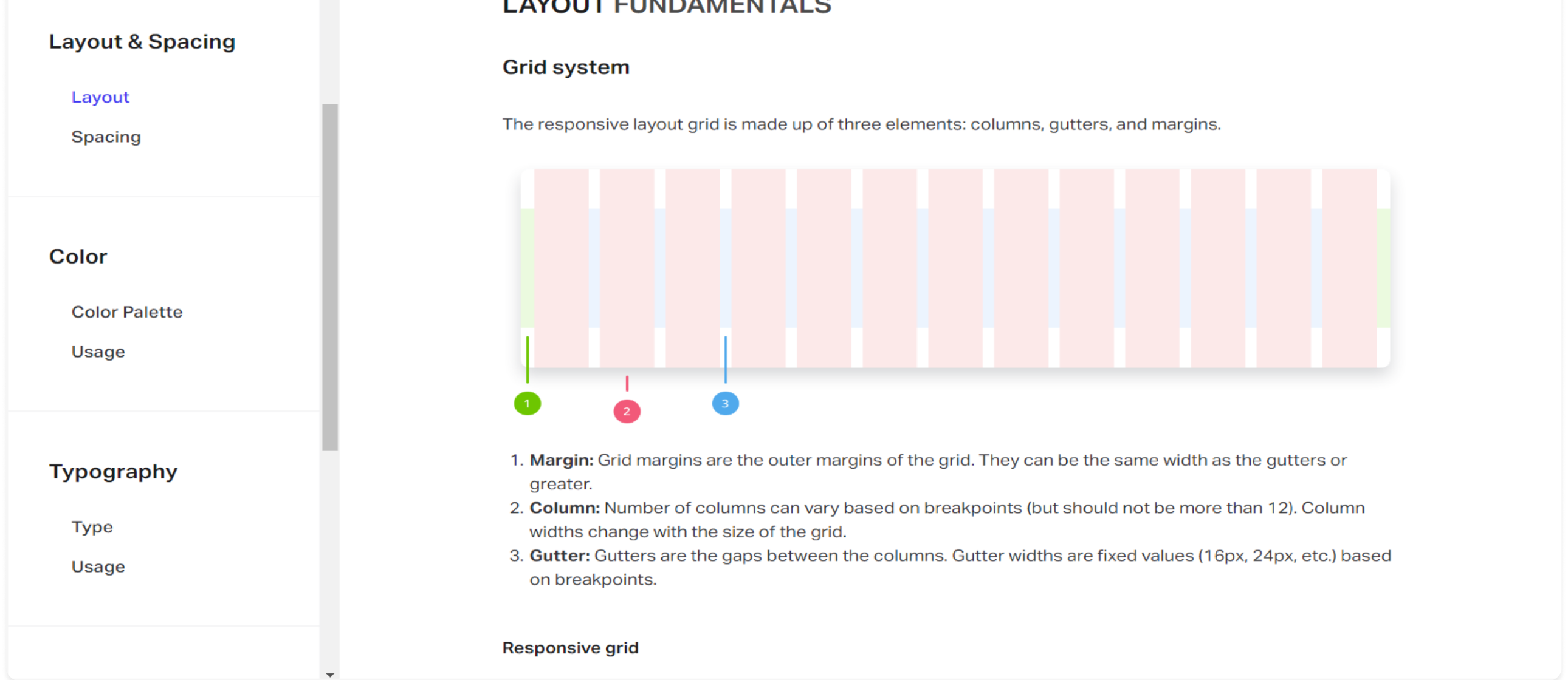
Aperia design system has two main components: Foundation and Component. Foundation is where we house all our design tokens, such as typography, color, and spacing. These foundational elements are crucial, as they serve as the building blocks of our library.

Typography foundation specification
Color foundation specification
Other foundation tokens for radius, spacing, and responsive layout

Building Components

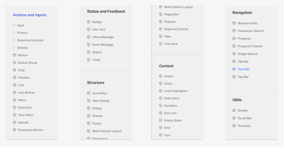
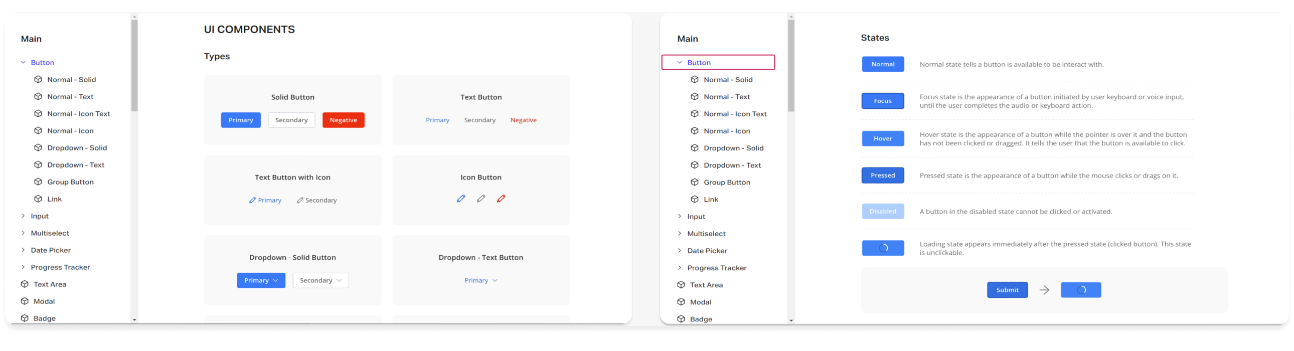
Each project has a component library, a collection of reusable interface elements themed by their foundations file. Throughout the design system we reference different component types such as global, structural, content, data, and utility. It was critical to define the differences between component classes so that design decisions are efficient and accurate based on the context of the page.

I define how components look and work, then set them up in Figma. On the other hand, discuss with developers to unify component APIs to make it consistent with Figma Variants.

Component library categories

For all components, I would built out all of their states and combine them as variants. To a component, designers would simply search for the component name in the Assets panel, pull in the component, and adjust settings to their liking.

I also conducted a series of Figma workshops to help designers get on board with the design system.

Tooltip component placement variants

This is component settings in action! It is super easy to use and allow designers to build hi-fi design extremely quickly. Components provide a standardize template for design consistency but also offer enough customization that help users to be creative with the design.

Since launched, we have built...

1000Web Component
3Design System Documents

Copy Writing

I worked with technical writers to document the voice and tone we should use in our products and some common-case recommended verb pages.

Copy writing layout and spacing documentation
Write description for component used for Design, QA, Dev Team

Documentations

In the main documentation, we document all UI specs and behaviors of components to make sure all members will understand and on the same page.

In the Storybook documentation, we document the component APIs and list out some common use cases, what should developers notice and what props to use in each case.

Main and Storybook documentation examples

Update All Interfaces

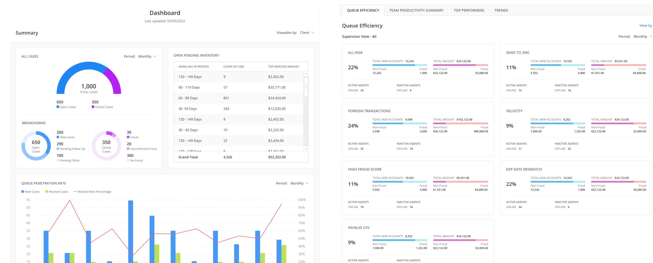
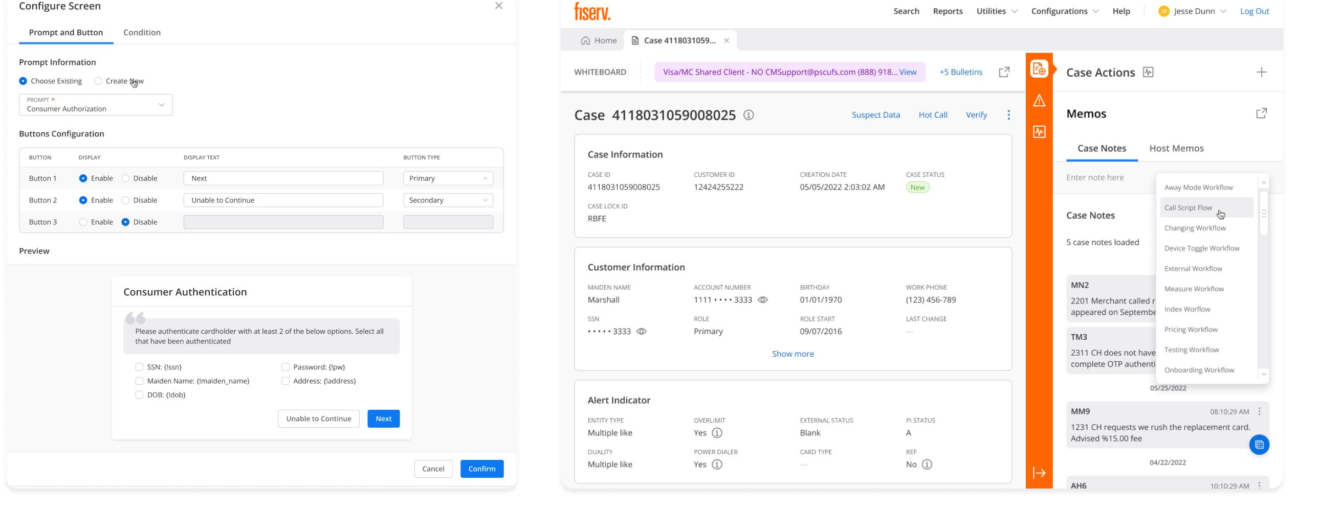
I revamped every screen in both products with the new design system, reconstructing hundreds of interfaces from scratch. This involved aligning everything with the 8-grid system and using auto-layout for easier editing and maintenance. While it was a time-consuming effort, it allowed me to gain a thorough understanding of the product.

Updated Aperia product interfaces

Accessibility Assessment

Following the WCAG guideline 3.0, I thoroughly reviewed all screens to ensure they align with industry standards. I simplified contrast, clear plugin consistency, and made sure all design elements were easily visible to the end user.

Accessibility documentation and WCAG review

With the new design system, designers can shorten delivery time by

5 TIMES

Client Feedback

Alice Hoang

Alice Hoang

Lead Design at Aperia

“I’m so impressed! The design system has significantly improved the consistency and efficiency of our product development process. It reduced design duplication, streamlined handoff between teams, and accelerated delivery across multiple products.”
Leo Tang

Leo Tang

Product Owner at Aperia

“I had the pleasure of closely collaborating with Tai during my time as a senior product owner at Aperia. From a product perspective, the new design system made it easier to scale decisions across the ecosystem. It brought alignment between teams, sped up delivery, and improved the overall quality of the user experience.”

Reflection

Key Takeaways

  • Designing at scale is not only about creating components, but about creating a shared language across teams.
  • In a large banking ecosystem, consistency improves both usability and trust.
  • A strong design system reduces repeated work and helps teams spend more time solving meaningful product problems.
  • Accessibility and documentation are core parts of the system, not extras added later.
  • The success of a design system depends on adoption, governance, and continuous improvement over time.

My Other Works

Scaling pharmacy onboarding across mobile and POS

Scaling pharmacy onboarding across mobile and POS

Helping drive 1,000+ new users in 14 days across 1,000+ pharmacy chains.

Design systems for speed at scale

Design systems for speed at scale

Built reusable components and guidance for fintech products, increasing build speed by 30%.

Thanks for stopping by!

Design and Develop by Tai

Ping me: manhtaiphung@gmail.com